Most people scan at whatever the scanner offers first. On a lot of printers that’s 300 DPI in full colour, which is fine until an upload form says “maximum 2 MB” and your three-page bank statement comes out at 1.1 MB per page.
We wanted to know which settings are worth using, so we scanned the same letter 15 different ways and measured two things: how big the PDF got, and whether text recognition (OCR) could still read every word. Here’s what we found.
How we ran the test
We made a one-page A4 letter that looks like the kind of thing people scan most: a lettings agency confirmation with a red and navy letterhead, body text at 11pt, a block of 6.5pt small print at the bottom and a signature in blue pen. We gave it an off-white paper tint, a slight tilt and a little blur, because real scans are never perfectly straight or sharp.
We then saved that page at five resolutions (100, 150, 200, 300 and 600 DPI) in three colour modes:
- Colour, saved as a JPEG at quality 75 (a typical scanner default)
- Grayscale, also JPEG at quality 75
- Black and white, meaning pure black or pure white pixels with no grey, saved with the same compression fax machines use (CCITT Group 4)
Each version became a one-page PDF. We ran every file through Tesseract, the free OCR engine behind many scanning apps, and counted how many words it got right, once for the main letter and once for the small print.
The results
| DPI | Colour | Grayscale | Black and white | Small print read correctly |
|---|---|---|---|---|
| 100 | 79 KB | 73 KB | 12 KB | 95% / 95% / 52% |
| 150 | 143 KB | 130 KB | 16 KB | 100% in all modes |
| 200 | 212 KB | 191 KB | 20 KB | 100% in all modes |
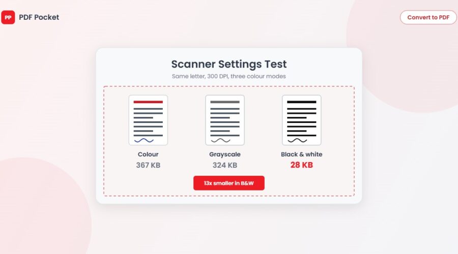
| 300 | 367 KB | 324 KB | 28 KB | 100% in all modes |
| 600 | 1,024 KB | 865 KB | 53 KB | 100% in all modes |
The main 11pt text was read at 99 to 100% in every single version, including 100 DPI. Normal-sized print is easy for OCR. Small print is where settings start to matter.
What the numbers tell you
600 DPI is almost never worth it
Going from 300 to 600 DPI made the colour file nearly three times bigger (367 KB to 1,024 KB) and didn’t read a single extra word. 600 DPI is for scanning photos you plan to enlarge or print, not for letters, forms and receipts.
Black and white is the biggest saving by far
At 300 DPI, black and white came out at 28 KB against 367 KB for colour. That’s about 13 times smaller, and it still read 100% of the small print. If the document is plain text on white paper, this is the setting that gets you under almost any upload limit.
The catch is that black and white throws away all colour. In our test, the red line in the letterhead and the blue signature both turned solid black. That matters if someone needs to see a coloured stamp, text marked with a highlighter pen or a signature in blue ink, which some banks and solicitors still ask for to show the document is an original.
Black and white also falls apart sooner when you drop the resolution. At 100 DPI it read only 52% of the small print, while colour and grayscale still managed 95%. Grey pixels hold detail that pure black and white loses, so if you go black and white, keep it at 200 DPI or above.
Grayscale saves less than you might expect
Grayscale files were only about 8 to 15% smaller than colour in our test. The paper tint and the JPEG compression did most of the work either way. Grayscale is still a sensible choice for documents with photos or pencil notes, but don’t expect it to halve your file size.
150 to 200 DPI covers most everyday scans
At 150 DPI, every mode read every word, small print included, and the colour version was 143 KB. That’s small enough to attach ten pages to an email without going near the 25 MB limit most providers set (we covered the exact limits in our guide to email attachment sizes). 200 DPI gives you a little more margin for blurry phone scans or very small text.
Which settings to use
- Letters, contracts, bank statements, payslips: 200 DPI, black and white. Switch to grayscale if there’s a stamp or signature someone needs to see clearly.
- Forms with coloured boxes or highlighter pen marks: 150 to 200 DPI, colour.
- ID documents and passports: 300 DPI, colour. Checks often look at security printing and photos, so don’t cut corners here.
- Receipts: 200 DPI, grayscale. Thermal paper is low contrast and fades, and black and white can lose the faint bits.
- Photos and artwork: 300 DPI or more, colour, and save as an image rather than a PDF if you can.
- Documents you’ll search later: any of the above at 150 DPI or higher, then run OCR so the text becomes searchable. Our guide on making a PDF searchable with OCR walks through it.
Already scanned at the wrong settings?
You don’t need to scan again. If the file is too big, run it through Compress PDF. When we tested it on real scans, a 5.9 MB colour scan came down to 646 KB on the medium setting (the full figures are in our compression test). If colour isn’t needed, Grayscale PDF strips it out first, and that often makes compression work better.
If you took photos of the pages on your phone, JPG to PDF joins them into one document, and Merge PDF puts separate scans in the right order.
A note on our test
We used a computer-generated page with simulated paper texture, blur and tilt, so the results are consistent and repeatable. A creased page or a dark phone photo will give OCR a harder time than ours did, which is one more reason to stay at 200 DPI rather than dropping to 100. The file sizes will also vary with your scanner’s own compression settings, but the pattern holds: resolution above 300 DPI costs a lot and gains little, and black and white is the single biggest saving for plain text.